Replit
We have no recorded result for Replit on this prompt, so there is nothing to compare here.
Not part of this comparison
If you need to turn plain-text process descriptions into readable animated diagrams, the best tools are the ones that keep labels accurate, preserve branching and loop-back logic, and export something usable without heavy cleanup. This review tested a RAG pipeline, a human-in-the-loop workflow, and a harder multi-branch edge case across prompt-based, LLM-based, and code-based tools.
Excellent on the single prompt tested, but it is a coding-agent workflow and not yet a fully comparable two-scenario result.
It scores the maximum because playback was described as smooth and clean, with no visible transition problems or rendering glitches to interrupt the motion.
We rank on the 3 checks that decide whether a tool does this job: Animation smoothness, Text-to-animation accuracy, Visual clarity. A check only carries a score when we recorded a finding for it, and a tool has to be measured on all of them to take the top spot. We also checked Ease of use, Export usability, Generation time — compared for you, but not part of the ranking.
Columns, left to right: Animation smoothness · Text-to-animation accuracy · Visual clarity
Pick the tools you care about, then compare what they returned or how they scored.
We have no recorded result for Replit on this prompt, so there is nothing to compare here.
Not part of this comparison
Rendered the full human-in-the-loop workflow, including reject, regenerate, approve, and final delivery, with clean looping motion; the main misses were the missing permanent 'Rejected' label and the lack of export to a downloadable file.
research-media-claude-20output-202-64cca8a367e5.mp4
It captured the approve/reject loop-back logic correctly, but the diagram was held back by broken icons, a connector that stopped short, and a node placement that disrupted the reading flow.
research-media-remotionai-20output-202-cab6702173e2.mp4
It built the correct approve-and-reject workflow, stayed stable through the render, and only left a few polish issues like clipped text and a missing arrowhead.
research-media-kodisc-20output-202-ccb9c487a415.mp4
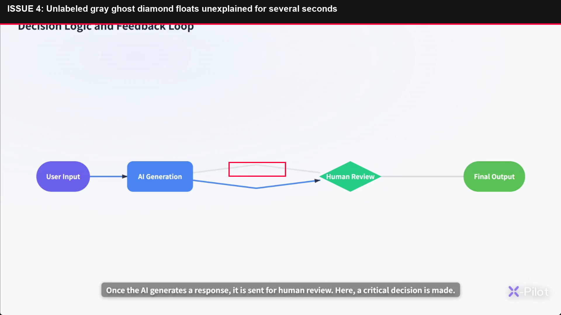
It got the human-in-the-loop logic right end to end, but the intro title glitch, blank start, overflowed label, ghost diamond, and caption/logo collision made the presentation feel rough.
research-media-image-d7beb6e0980a.png
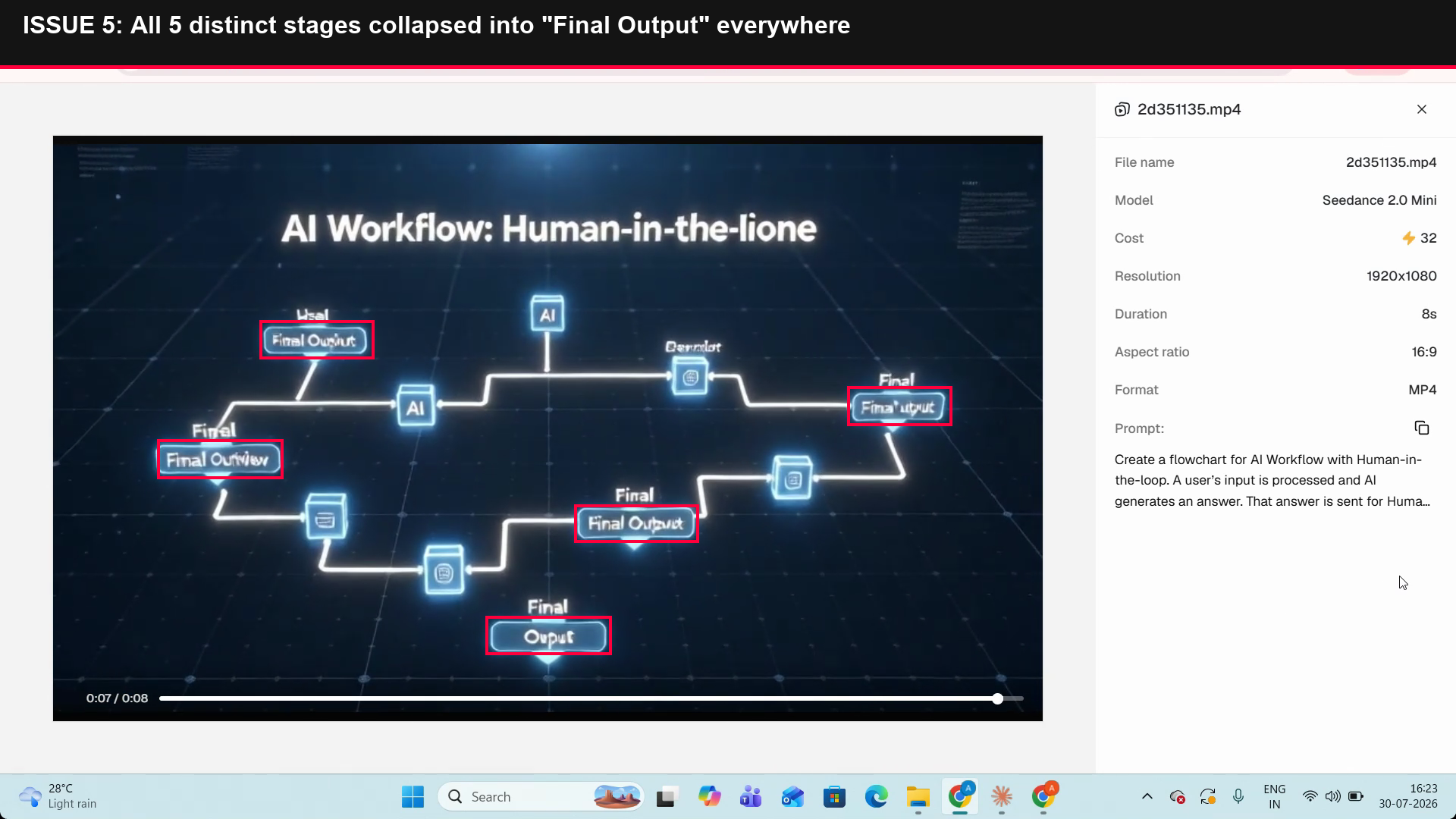
It shows a useful approve/reject moment and roughly tracks the workflow at first, but the title and labels degrade into unreadable text and the final recap collapses the whole branching logic into repeated output blocks.
research-media-image-f6d0a9a83dfa.png
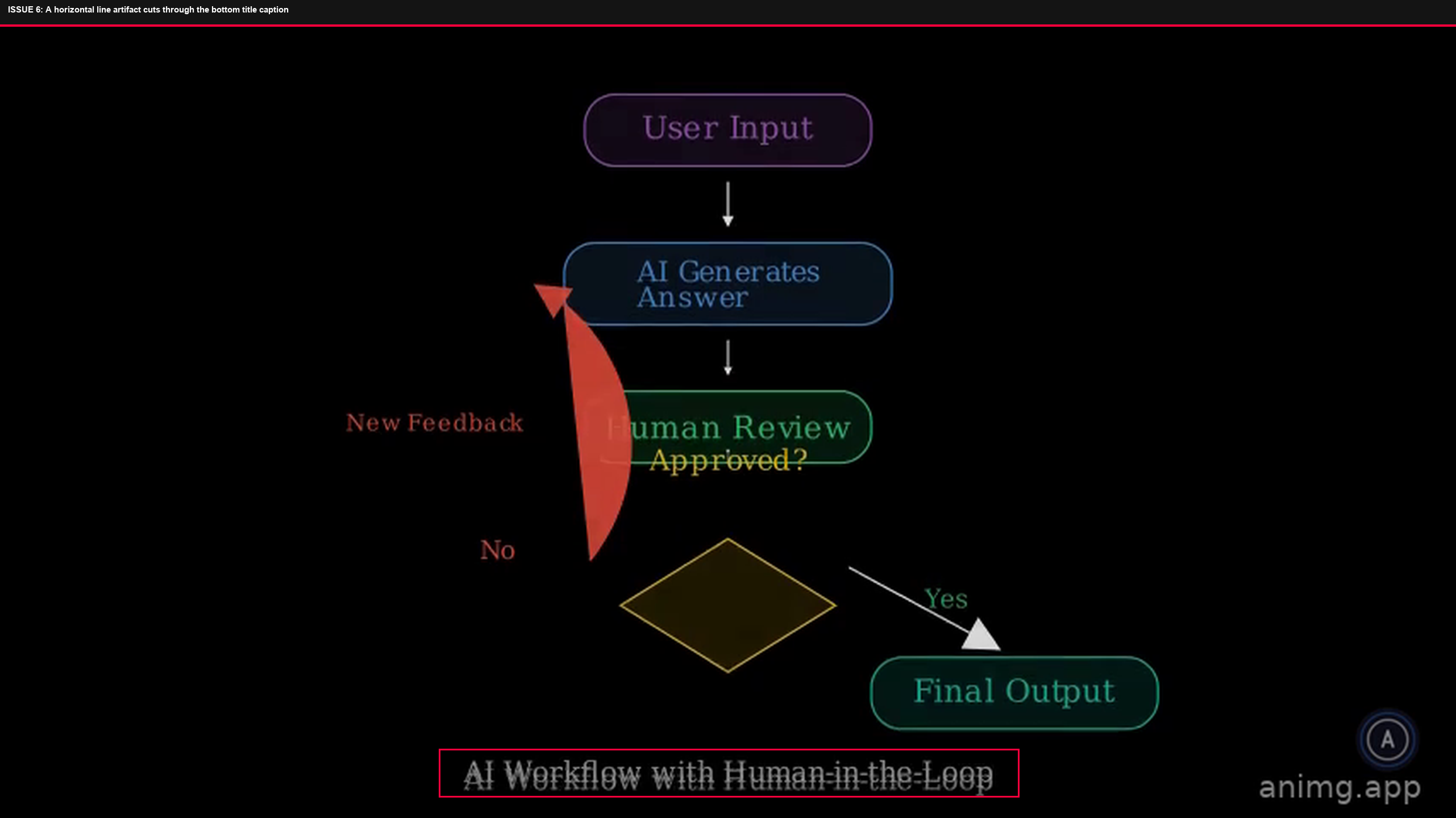
It showed the right approval/reject path, but the unlabeled decision point, fading No loop, and text-covered review step made the branching hard to trust.
research-media-image-51ec64d77c67.png
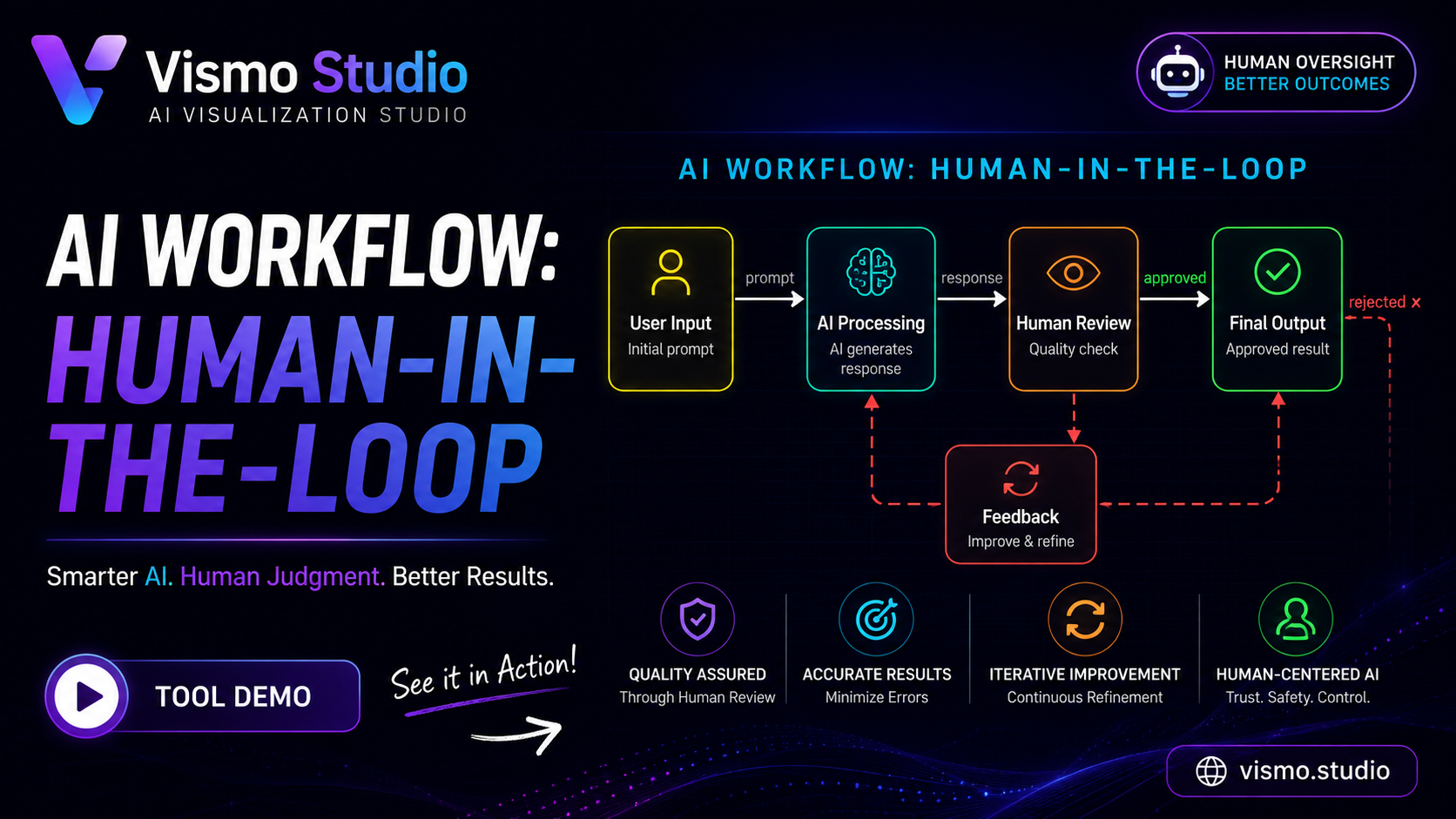
It rendered the complete human-in-the-loop workflow, including the approval path and the rejected feedback loop, in a clear diagram/video.
research-media-ai-20workflow-20human-in-the-loop-20vism-fa0945859032.png
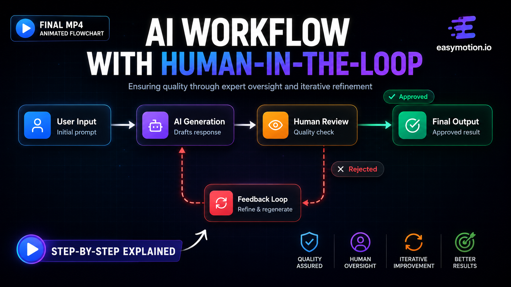
It rendered the human-in-the-loop prompt as the expected user input→AI generation→human review→approved/rejected feedback loop flowchart, with clear branching and readable labels.
research-media-ai-20workflow-20with-20human-20thumbnail-f5494027a321.png
It created a correct human-in-the-loop workflow with user input, AI generation, human review, approval, and a rejection loop back to AI, and the flow was laid out clearly with a helpful legend.
research-media-b8d23604-610d-411c-843f-9e7944d83890-362868ce1796.mp4
Open a tool to inspect every recorded check and finding.
It scores the maximum because playback was described as smooth and clean, with no visible transition problems or rendering glitches to interrupt the motion.
The reveal animation was smooth, with the report explicitly stating no overlaps, no ghost artifacts, and no rendering bugs in frame-by-frame review.
permalink to this finding →Replit is the overall winner because it is the only fully measured tool at the top and it scored a clean 5.0/5.0 on all three decisive checks: animation smoothness, text-to-animation accuracy, and visual clarity. That makes it the strongest all-around fit for accurate custom-app diagram animation. The main trade-off is practical, not quality: it was not a one-click exporter, and its ease of use was only 3.0/5.0. Claude AI is the closest alternative if you want a smoother workflow in-chat: it matched Replit on animation smoothness and was much easier to use, but it scored lower on text-to-animation accuracy and visual clarity, and it also stayed in-chat with export usability at 1.0/5.0. X-Pilot is the pick when branching logic matters most, but its recurring layout and timing glitches kept its smoothness and clarity far behind the leaders. Framia has smooth motion, but label rendering is the bottleneck. Kodisc is strong at prompt-to-diagram logic but was held back by glitchy labels and one frozen render. AnimG is usable and exports well, but its layouts break down on flowchart-style diagrams. The tools ranked below #6 all have incomplete decisive-check coverage, so even their stronger-looking scores do not put them above the fully measured tools under this policy. Among them, Vismo Studio, EasyMotion, Academa AI, and Remotion AI all look promising on text-to-animation accuracy and visual clarity, but they were only partly tested, so they cannot take the top spot.
The tools we tested for this use case — each card opens its full tested review.
If you are looking to build a custom text-to-diagram animation, process visualization, or workflow diagram system for your business or internal workflow, email us at contact@futuresmart.ai.
Found something inaccurate or missing? We try to keep our AI research accurate and useful. If you found outdated information, an issue, or have a suggestion, email us at collaborate@aidemos.com.
Comments (0)