Best AI Tools to Query Live Databases Using Plain English
We tested five AI database tools on the same live ecommerce database to see which ones let non-technical teams ask plain-English questions, inspect the SQL, follow up naturally, and get readable tables, charts, and business conclusions.
How We Tested
All tools were tested against the same ecommerce-style live database and the same three prompt groups, increasing from a simple customer-acquisition comparison to multi-table best-customer analysis and then a deeper order-pipeline follow-up chain. We evaluated whether each tool could understand plain English, generate and show SQL, execute against the live database, return readable business-facing answers, keep follow-up context, generate useful visuals, and support reuse through export or dashboards.
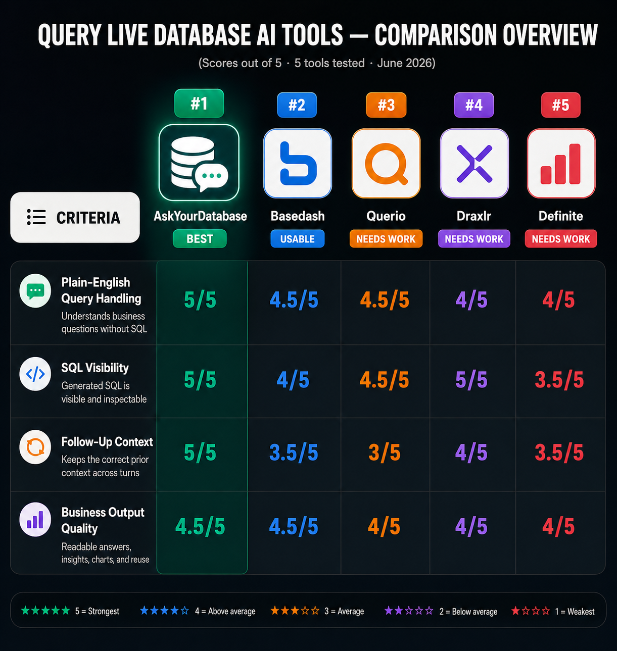
The Ranking
5 toolstested head-to-head on the same input. Each card shows the verdict and per-criterion scores. Click "Full breakdown" for the artifact-level evidence.
Scores are inferred by AI from the researcher's hands-on observations and ranked by their aggregate.
Best practical direct NL2SQL tool.
Best UX and agentic execution reference.
Best analyst workspace reference.
Best SQL-first exploration reference.
Best dashboard generation reference.
Full breakdown
Every claim below is a recorded finding from our own testing — the score, the note, and the screenshots behind it. Nothing is summarised from memory.
AskYourDatabase
Best#1 of 5Strong all-around NL2SQL workflow with especially good follow-up reasoning and reusable outputs, but charts are not automatic.
How it scored
Ambiguity Handling5/5Business Insight5/5Chart / Visualization Support3/5Follow-Up Context5/5Plain English Query Handling5/5Dashboard Workflow5/5Result Readability5/5FS Learning Value5/5SQL Generation5/5SQL Visibility5/5Export / Reuse5/5▸Ambiguity Handling5/52 worked well2 findings
It clarifies ambiguous business terms rather than silently assuming one meaning, and it does so in both the customer-ranking and date-reference cases. That merits 5/5.
Clarifies the vague phrase 'last month' as April 20, 2026 before running the comparison, rather than guessing silently.
Resolves the ambiguity in 'best customers' by surfacing both definitions instead of silently choosing one, producing separate ranked lists for order count and spend.
▸Business Insight5/53 worked well3 findings
The tool does more than report numbers; it explains what they mean operationally and commercially. The insights are specific and useful, so 5/5.
Automatically adds business interpretation, including a quantified ~48% acquisition decline and the observation that 11 of 12 recent signups came in May 2026.
Automatically explains what the rankings mean, flagging Rahul Sharma as the all-rounder, Mohan Vishe as a red-flag account with 4 unpaid orders, and Vikram Singh as the biggest spender at $74,338.82.
▸Chart / Visualization Support3/51 mixed1 finding
Visualization exists, but it is not automatic; the user must ask for it again before charts/dashboard views appear. That is genuinely mixed support, so 3/5.
Visualization is not generated on the first answer; the dashboard-style view appears only after an extra prompt, so chart support is available but not automatic.
▸Follow-Up Context5/52 worked well2 findings
Follow-up memory is clearly working: it keeps the customer set and the order-state context aligned across turns, so this scores 5/5.
Carries the prior ranking context into follow-ups, correctly checking the same 3 customers for unpaid orders and then reusing that same 3-customer context for payment-method analysis.
Retains the prior 'pending but paid' state across turns and compares the same metric over time, showing 13 stuck orders on April 20, 2026 versus 2 on May 20, 2026.
▸Plain English Query Handling5/53 worked well3 findings
This is consistently strong plain-English handling across multiple scenarios: it understands compound, informal, and chained follow-up questions without needing SQL from the user, so 5/5.
Handles a 4-step operational follow-up chain in plain English and keeps the conversation moving from current status, to percentages, to edge cases, to month-over-month comparison.
Interprets an informal 'best customers' request as two separate ranking dimensions—order frequency and total spend—without forcing the user to specify SQL.
▸Dashboard Workflow5/51 worked well1 finding
The workflow can turn an answer into a dashboard-style reusable view, including a downloadable dashboard image, so this is clearly 5/5.
Can turn a result into a dashboard-style visual view and exposes a downloadable dashboard image from the visualization screen.
▸Result Readability5/52 worked well2 findings
The outputs are consistently easy for a non-technical user to scan: clear tables, named entities, and concise narrative summaries. That is strong enough for 5/5.
Returns a non-technical summary table with named customers, emails, phone numbers, and created dates, plus a 12-vs-23 period comparison that is easy to scan.
Presents the status breakdown in a compact 7-row table and then summarizes the 93-order total in plain English, including delivered at 26.9% and cancelled at 14.0%.
▸FS Learning Value5/51 worked well1 finding
The clearest improvement direction for an FS NL2SQL agent is obvious from the observed weakness: auto-generate charts/dashboards by default instead of waiting for a second prompt. That is a useful, actionable learning signal, so 5/5.
The clearest improvement direction for an NL2SQL agent is to auto-generate visualizations by default, since the workflow repeatedly requires an extra 'visualize it' prompt before charts appear.
▸SQL Generation5/51 worked well1 finding
The observed SQL generation is clearly correct on the tested compound request, producing multiple appropriate statements in one turn. Only one direct generation observation is available, so the score is strong but confidence is slightly lower.
Generates multiple database queries in one turn for a compound request; here it produced 3 separate SQL statements for the customer list, the last-90-day count, and the previous-90-day count.
▸SQL Visibility5/51 worked well1 finding
Users can inspect the exact SQL throughout the tested workflows, including simple and complex multi-CTE queries, so this is a clean 5/5.
Across the tested workflows, the tool surfaces the generated SQL directly in the chat, so users can inspect the exact query text instead of getting a results-only answer.
▸Export / Reuse5/51 worked well1 finding
The tool clearly supports reuse outside the immediate chat via API, WhatsApp integration, and publish/embed options. That is strong export/reuse support, so 5/5.
Supports reuse outside the chat through an HTTP API, WhatsApp integration, and a publish/embed workflow, so results are not confined to the conversation UI.
Basedash
Usable#2 of 5Strongest at clean plain-English business analytics and dashboard-ready outputs, but weak on ambiguous follow-ups and SQL transparency.
How it scored
Ambiguity Handling2/5Business Insight5/5Chart / Visualization Support5/5Follow-Up Context4/5Plain English Query Handling5/5Dashboard Workflow4/5Result Readability5/5FS Learning Value5/5▸Ambiguity Handling2/51 mixed1 failed2 findings
Ambiguity handling is weak: one case is mixed and another is effectively a failure because the tool silently narrowed scope instead of clarifying. That is better than total collapse, but still poor.
When asked about 'the top 3 from that list,' it did not ask which leaderboard the user meant; instead it silently checked the top 3 highest spenders and then added a separate top-3-by-order-count check after noticing the ambiguity.
When asked to 'compare that to last month' with the 'same breakdown,' it narrowed the scope to the paid-pending subproblem and did not compare the full earlier pipeline breakdown or ask a clarifying question.
▸Business Insight5/53 worked well3 findings
The tool consistently translates counts into meaningful business takeaways, not just raw numbers, and does so in a way that directly answers what the result means.
Explains the business meaning of the rankings by naming Rahul Sharma as the best all-around customer, Mohan Vishe as the most frequent buyer with 4 orders, and Deepak Kulkarni as the biggest spender at 15,338.82.
Turns raw operational counts into an actionable readout by flagging 2 orders as pending but already paid and then noting that those cases are older unresolved orders rather than new ones from this month or last month.
▸Chart / Visualization Support5/52 worked well2 findings
It automatically produced useful charts in the tested analytics flows, showing clear support for visual exploration without requiring the user to ask for a chart explicitly.
Automatically renders a bar chart for the live order-stage breakdown alongside the table of 93 orders split across stages such as Delivered 25, Pending 22, and Shipped 15.
Automatically generates a vertical bar chart for the 90-day acquisition comparison, so the user gets a visual period-over-period view instead of only text.
▸Follow-Up Context4/51 worked well1 finding
The tool does remember and reuse prior context, especially in chained follow-ups, but the later order-pipeline conversation shows it can drift into a narrower interpretation of what the user meant, so this is good but not flawless.
Carries forward the prior ranking context in a follow-up and reuses the same top-3 spender list when summarizing payment methods, including Rahul Sharma as mostly UPI with one Credit Card use.
▸Plain English Query Handling5/53 worked well3 findings
The tool consistently worked on all three scenarios, understanding multi-part business questions, follow-ups, and operational language directly in plain English with no evidence of breakdowns in comprehension.
Understands a two-part business question in plain English and returns both the customer list and the acquisition comparison without requiring SQL; the response covered 11 recent customers versus 22 in the previous 90 days.
Understands an open-ended 'best customers' request as two leaderboard views, returning both top-by-orders and top-by-spend tables without manual SQL.
▸Dashboard Workflow4/51 worked well1 finding
The tool clearly supports turning an answer into a reusable dashboard element, but the observation set only shows this in one scenario, so it is strong evidence without being exhaustive.
Exposes an Add to dashboard action on the result page, letting the acquisition answer be reused as a dashboard tile or view rather than only a chat result.
▸Result Readability5/51 worked well1 finding
Across the scenarios the output is consistently compact, table-driven, and non-technical, making it very easy for a business user to scan and understand.
Presents the answer as compact, easy-to-scan ranked tables with consistent columns such as orders, total spent, average order value, last order, and payment-method usage, which keeps the multi-step answer readable for nontechnical users.
▸FS Learning Value5/51 worked well1 finding
The observations surface a very actionable learning signal: the tool’s main weakness is ambiguous follow-ups being silently narrowed, which is exactly the kind of improvement direction useful for FS NL2SQL development.
The research exposes a concrete improvement direction for an FS NL2SQL agent: add clarification prompts for ambiguous follow-ups, because 2 conversational scenarios were silently narrowed instead of being confirmed with the user.
Querio
Needs work#3 of 5Strong at automated conversational SQL with charts and follow-up handling; weaker on deep context selection and human-friendly labels.
How it scored
Ambiguity Handling4/5Business Insight4/5Chart / Visualization Support5/5Follow-Up Context3/5Plain English Query Handling4/5Result Readability3/5▸Ambiguity Handling4/51 worked well1 finding
The tool handles ambiguity well by decomposing the vague 'best customers' request into two sensible dimensions instead of guessing. That is strong ambiguity handling, though it is based on one observed case, so 4/5.
Resolves an ambiguous 'best customers' request by splitting it into two separate rankings instead of silently guessing a single definition.
▸Business Insight4/51 worked well1 finding
The tool does more than restate numbers; it explains the meaning, quantifies the change, and adds trend context. That is strong business interpretation, though only one direct observation supports it, so 4/5.
Explains the business meaning of the result with numbers and trend context, including 11 new customers in the last 90 days versus 28 in the prior period and the reported 61% decline.
▸Chart / Visualization Support5/52 worked well2 findings
Multiple scenarios show automatic chart generation, including several distinct chart views per question. That is consistent and robust, so 5/5.
Automatically produces multiple chart views for one question, including a 90-day period comparison and a weekly trend view over the wider 180-day window.
Automatically renders chart views for the stage breakdown, the delivered-vs-cancelled share, and the month-over-month comparison.
▸Follow-Up Context3/51 worked well1 struggled2 findings
One follow-up chain is handled correctly, but another deeper follow-up loses the intended context and narrows the comparison incorrectly. That balance is clearly mixed, so 3/5.
Misreads a 'same breakdown' follow-up by narrowing the comparison to delivered-vs-cancelled instead of preserving the broader order-stage breakdown from the earlier context.
Carries the same top-3 customer IDs forward across follow-ups, using them again for the unpaid-order check and the payment-method lookup.
▸Plain English Query Handling4/51 worked well1 finding
The only direct observation shows it accepts a plain-English business question immediately and starts analysis without SQL. That is strong evidence of capability, but it is only one scenario, so I score it 4/5 rather than claiming perfect coverage.
Understands a straightforward business question in plain English and starts the analysis without requiring the user to write SQL.
▸Result Readability3/51 mixed1 finding
The output is structurally readable, but the use of UUIDs instead of names makes it noticeably less user-friendly. That is a genuine mixed result, so 3/5 fits best.
Returns the 'best customers' analysis using UUID customer IDs rather than human-readable names, which makes the output less friendly for non-technical users.
▸SQL Generation5/52 worked well2 findings
Two separate observations show correct SQL logic on both aggregation and edge-case filtering. Because it works on both a ranking query and a conjunctive filter with the expected result counts, this merits 5/5.
Generates a correct conjunctive filter for the pending-but-paid edge case and returns exactly 2 matching orders.
Generates a customer-spend aggregation grouped by customer_id and sorted by total spend descending, returning order_count, total_spend, avg_order_value, and last_order_at.
▸SQL Visibility5/51 worked well1 finding
The observation explicitly says the generated SQL stays visible inline and inspectable. That is a direct full-hit on the criterion, so 5/5.
Keeps generated SQL visible inline so users can inspect the actual query text rather than only the rendered result table.
Draxlr
Needs work#4 of 5Strong SQL execution and follow-up context, but weaker on visualization and non-technical presentation
How it scored
Ambiguity Handling2/5Business Insight4/5Chart / Visualization Support2/5Follow-Up Context5/5Plain English Query Handling5/5Dashboard Workflow5/5▸Ambiguity Handling2/51 struggled1 finding
The tool did not clarify the ambiguous phrase and instead guessed a narrower interpretation, which is exactly the kind of ambiguity-handling weakness that merits a low score.
Resolves the phrase "same breakdown" by narrowing to the immediately previous pending-paid metric instead of the full stage breakdown, and does so without asking for clarification.
▸Business Insight4/52 worked well2 findings
The tool does explain what the numbers mean in some cases, including a useful AI summary and a dominant-payment-method insight, but the behavior is inconsistent enough that it’s not a perfect 5.
Automatically adds an AI Summary to the order-stage breakdown that interprets the totals, explicitly calling out 92 total orders and DELIVERED as the largest bucket with 25 orders.
Adds a higher-level payment insight by flagging each top customer’s usual payment method, turning per-method counts into a dominant-method summary for all 3 customers.
▸Chart / Visualization Support2/51 failed1 finding
Visualization support is weak: the observed follow-up drilldowns stayed table-only, and the broader report describes wrong or missing auto-chart choices. That supports a low score.
Does not automatically visualize the 2 follow-up drilldowns; both the unpaid-order check and the payment-method breakdown stayed table-only, leaving the user without a chart for either turn.
▸Follow-Up Context5/51 worked well1 finding
The tool consistently preserves conversational state across drilldowns, including the same top-3 set and later comparisons, which is strong evidence for a top score.
Maintains conversational context across a 2-step drilldown, preserving the same top-3 customer set when it adds unpaid-order checks and then payment-method breakdowns.
▸Plain English Query Handling5/51 worked well1 finding
The observed run shows the tool understanding a business question in plain English without SQL and producing the intended comparison correctly, so this is a strong 5/5 on the evidence available.
Understands a plain-English customer-acquisition question without SQL and computes the 90-day comparison correctly, returning 13 current-period customers versus 29 previous-period customers with a -16 difference and -55.17% change.
▸Dashboard Workflow5/51 worked well1 finding
This is directly supported by the cross-scenario observation that every observed result page had an Add to Dashboard action, so a perfect score is justified.
Exposes an Add to Dashboard action on every observed result page, so ad hoc answers can be turned into reusable dashboard items across scenarios.
▸SQL Generation5/51 worked well1 finding
The evidence shows correct database-backed query generation for a tricky edge case, with defensive logic and a valid result set, which supports a top score.
Generates a query that isolates the pending-but-paid edge case, producing a dedicated result set for orders where current status is pending and payment status is paid.
Definite
Needs work#5 of 5Strong dashboard-style analyst with solid business commentary, but weak at ambiguity handling and inline visualization
How it scored
Ambiguity Handling1/5Business Insight5/5Chart / Visualization Support3/5Follow-Up Context5/5Plain English Query Handling4/5Dashboard Workflow5/5Result Readability4/5FS Learning Value4/5▸Ambiguity Handling1/51 failed1 finding
This is broken on the core ambiguity case: it guesses instead of clarifying, so the score is 1/5.
It did not ask a clarification question for the ambiguous phrase "best customers" and instead silently chose total spend as the only ranking criterion.
▸Business Insight5/53 worked well3 findings
All observed scenarios included useful interpretation beyond raw rows and counts, so business insight is consistently strong at 5/5.
It adds business interpretation beyond the raw counts, including that acquisition fell from 22 to 12 customers and that the new customers were clustered in two bursts rather than arriving steadily.
It explains the operational meaning of the results, including that 47 orders are active, 36 are resolved, 13 are cancelled, and the month-over-month view is still provisional because May is incomplete.
▸Chart / Visualization Support3/52 mixed2 findings
It can produce useful charted dashboard views, but they are not inline and require extra workflow, so this is genuinely mixed at 3/5.
It can surface useful visual views such as a KPI summary and donut chart for the order breakdown, but the chart appears in a separate dashboard rather than directly in the chat response.
Visualization was not generated inline in the chat; instead, the tool produced a separate dashboard/app with a trend chart and multiple views after visualization was requested.
▸Follow-Up Context5/52 worked well2 findings
Across both tested follow-up flows, the tool preserved context correctly and reused prior answers coherently, so this is a 5/5.
It kept the earlier order-stage context across multiple turns, reusing the prior breakdown to compute delivery-versus-cancellation rates and then compare the same breakdown against last month.
The tool retained the same top-3 customer context across follow-ups, correctly checking unpaid orders first and then payment methods for those same customers.
▸Plain English Query Handling4/52 worked well1 struggled3 findings
Mostly strong plain-English understanding: two scenarios were handled well, but one important multi-intent prompt was only partially interpreted, so this lands at 4/5 rather than a perfect score.
The tool handled a four-step natural-language operational analysis, answering current stage counts, delivered-vs-cancelled percentages, pending-but-paid exceptions, and a month-over-month comparison.
It partially understood the request but reduced "best customers" to a spend-only ranking, ignoring the "order the most" part of the question.
▸Dashboard Workflow5/51 worked well1 finding
The tool clearly supports a dashboard-style workflow from query result to reusable multi-view artifact, so this earns 5/5.
Across the tested flows, the tool can turn query results into a reusable dashboard/doc view with multiple panes or sections instead of only a text reply.
▸Result Readability4/51 worked well1 finding
The observed answer is clearly formatted and non-technical-friendly, but evidence is limited to one scenario, so this is a strong-but-not-perfect 4/5.
It presents the answer in a clean comparison table plus a readable customer list with name, email, phone, and created-date columns, making the result easy to scan.
▸FS Learning Value4/51 worked well1 finding
The observed failure mode is a useful training signal for an FS NL2SQL agent, but evidence comes from one scenario only, so this is a strong 4/5 rather than a universal 5.
This scenario exposes a useful improvement target for an FS NL2SQL agent: when a prompt combines multiple ranking intents, the system should clarify or combine the criteria instead of collapsing them into one metric.
Final Take
AskYourDatabase is the best overall pick if you want a business user to ask a live database questions in plain English, see the SQL, and keep drilling down through follow-ups without getting lost. Basedash is the best runner-up for teams that care most about clean UX, automatic charts on simple comparisons, and resilient agent behavior. Querio is compelling for analyst-style multi-output work but needs safer deep follow-up context. Draxlr is best when SQL visibility, export, and chart switching matter more than simplicity. Definite is the specialist choice when the goal is to turn a chat answer into a reusable dashboard rather than get the fastest direct answer.